NHM Incidents by Device Over-Range
This chart shows how many NHM Incidents (see Understanding NHM Incidents and Events) occured for a device over a selected number of hours.
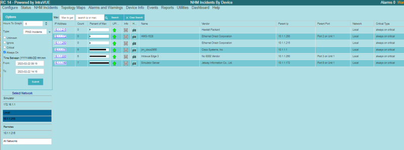
Like most other charts, on the left is a control panel to select how many Hours To Graph, which Critical Types to graph, and which Networks to graph.
You can select graphing for either Ping, XMIT, or RECV incidents as well as how to Sort and label the devices.
The Count column shows how many incidents occurred during the period for a device. The Percent of Max column shows how this device compares to the device having the most incidents in the time period.
The Up/Down column indicates if the device is currently connected.
The Info column icon opens the DeviceInfo Popup
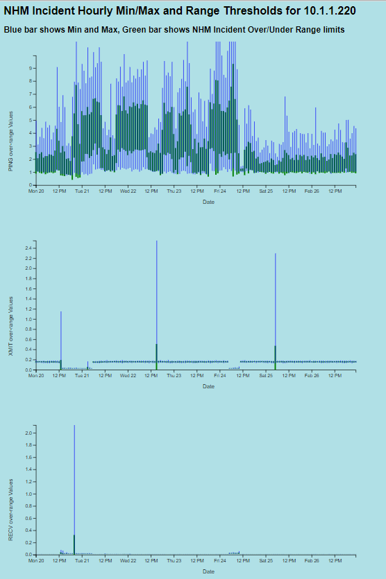
The History column, with the  icon, shows the values WBC Network Health Monitor calculated for this device for each hour of the week. It shows the Min and Max thresholds for each of Ping, XMIT, and RECV as well at the value that is the result of adding/subtracting the number of standard deviations to the average. The number of standard deviations is calculated based on analysis of the frequency responses were less than 1, 1-2, 2-3, 3-5, 5-10, and over 10 standard deviations above average. See the StdDevs-Over Counts column of Threshold Analysis and Configuration Report
| Introduction |
|
| Key Features and Benefits |
|
| Getting Started |
|
| Update Intravue |
|
| Notes on User Interface |
|
| Configuration |
|
| Connecting to an IntraVUE |
|
| WBC Network Health Monitor Settings |
|
| Email Settings |
|
| Database Settings |
|
| Real-Time IntraVUE Management |
|
| IntraVUE Status |
|
| IntraVUE Dashboard |
|
| Summary Statistics |
|
| Highest Ping Response Devices |
|
| Highest Bandwidth Devices |
|
| Uptime and Statistics |
|
| Hypertree Network Map |
|
| Tree View Network Map |
|
| Reports |
|
| Device Info |
|
| Alarms and Warnings |
|
| Events |
|
| Threshold Analysis and Configuration Report |
|
| Time Based CRC and IfInErrors Report |
|
| Connection History Report |
|
| 1 Week Disconnected Devices Report |
|
| Disconnections by Minute Chart |
|
| Ping Failures by Minute Chart |
|
| Switchprobe (analysis) Reports |
|
| Utilities |
|
| Device Editor |
|
| KPI Management |
|
| Create a 'clean' database with existing ranges |
|
| Vendor Name Management |
|
| DeviceInfo Popup |
|